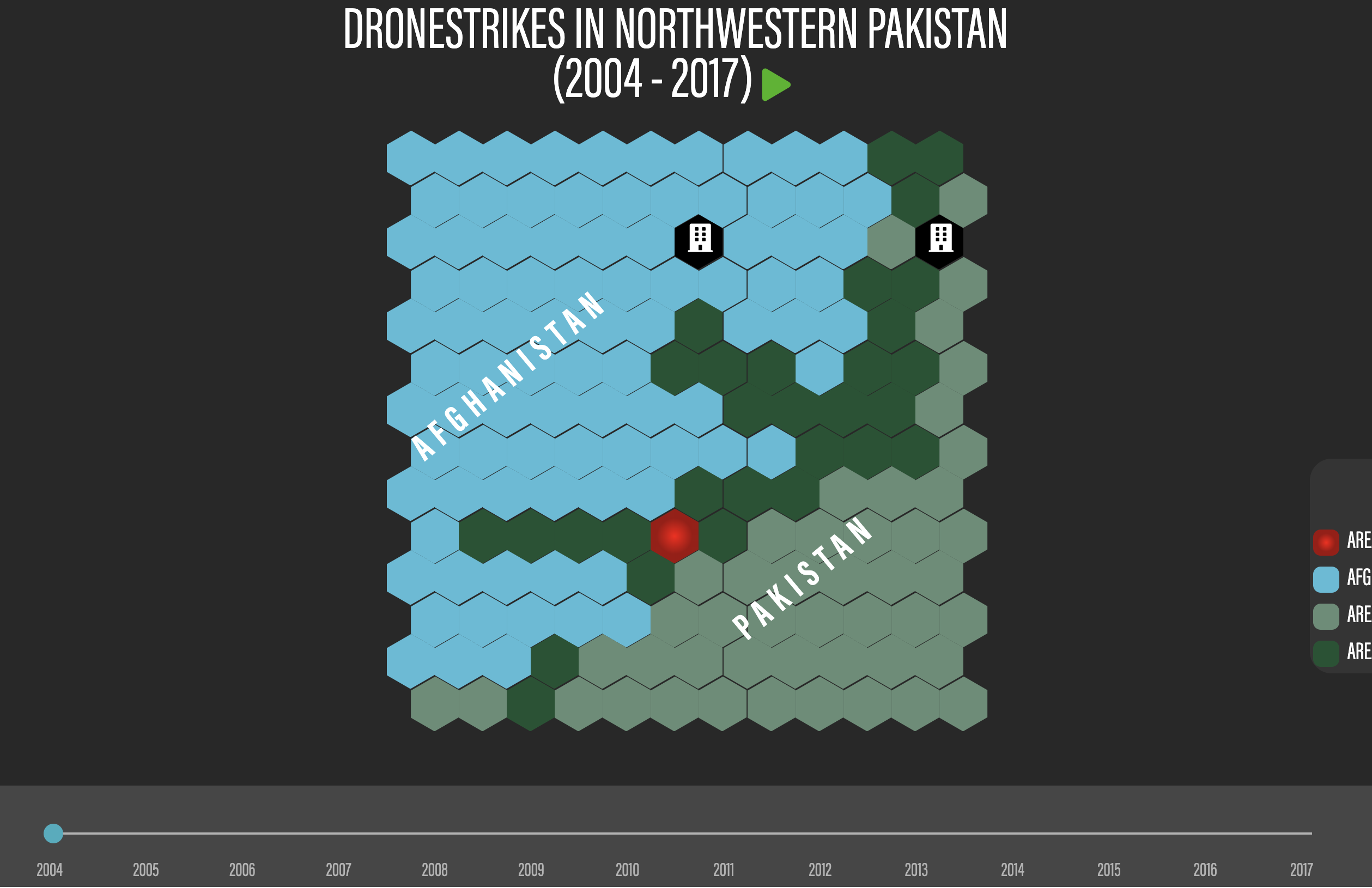
Based on the this
data visualization
of Brexit created by the National, as a part of my internship for
the news agency, I was tasked with developing a visualization for
dronestrikes in Northwestern Pakistan. This visualization is
intended to show the devastation that these strikes have caused
for the people of the region, displaying the strikes' catastrophic
civilian casualties. This project uses
data
from The Bureau of Investigative Journalism on the casualties of
each strike in the region.
For this project I worked closely with the web development team
and design team, trying to create as effective as a visualization
as possible. Color choices were extremely important, as well as
establishing where in Pakistan this map was. In order to do this,
red was used for each hexagon to show that there were strikes in
that location for that year and a dark green was used to show all
the regions that were struck within the period from 2004 to 2017.
Light green was used to denote areas of Pakistan that were not
targeted by drone strikes and a light blue was used to show
Afghanistan. The visualization uses a play button that makes the
visualization play from that year until the final year (2017), as
well as a scrollable timeline that allows users to see strike data
on the map for that year.