Created for the class Types of Art
This project was created for a typography class. The posters were
carefully made with the intention of exploring the history and
characteristics of the typeface through the design and layout. In
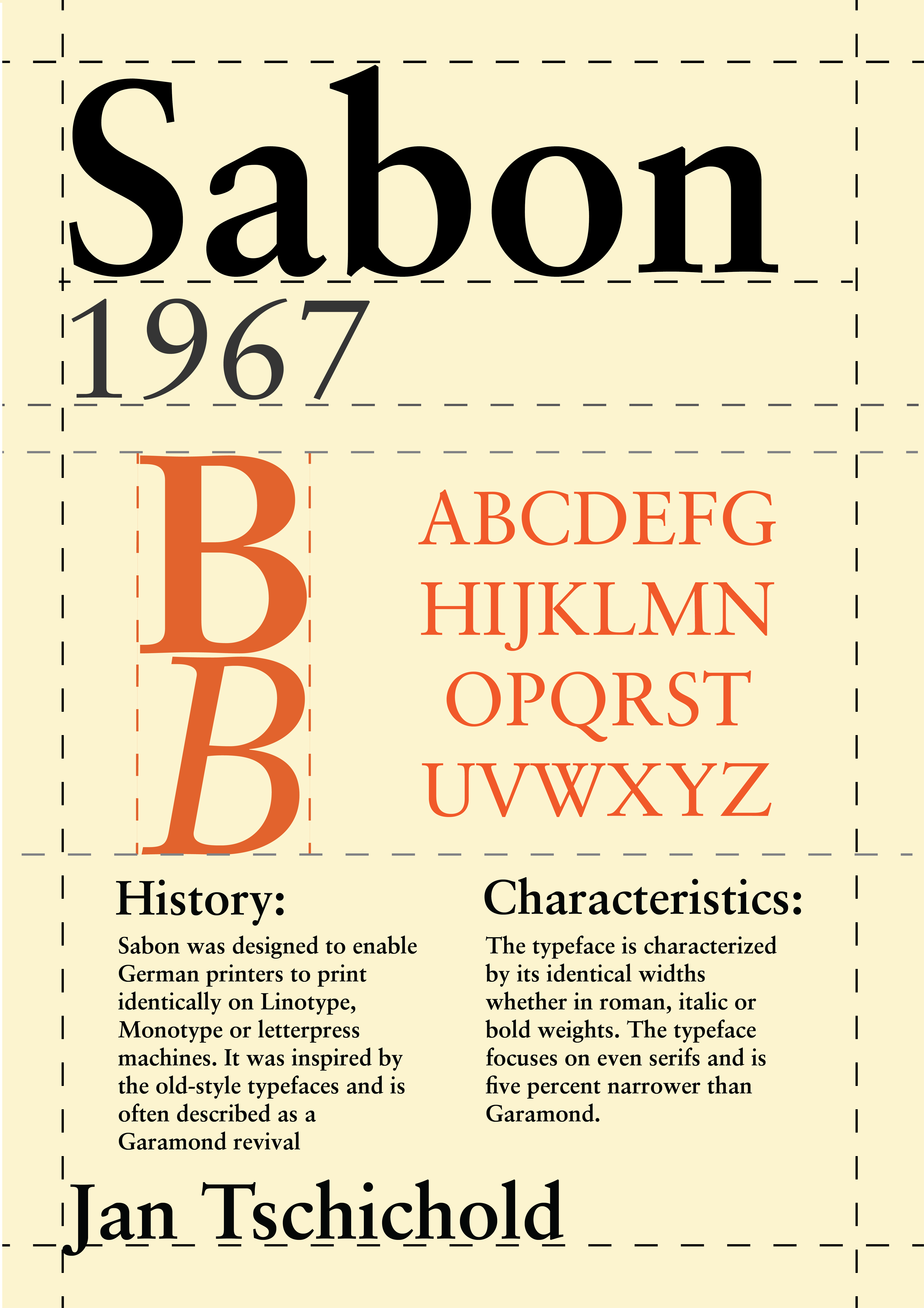
the case of Sabon, the typeface's heavy prevalence in
printing as a typeface ideal for body text was reflected through
the poster's use of a grid. The colors for the poster were also
inspired by early uses of Sabon, specifically its use in early
printings of Penguin Books. The design of the poster for
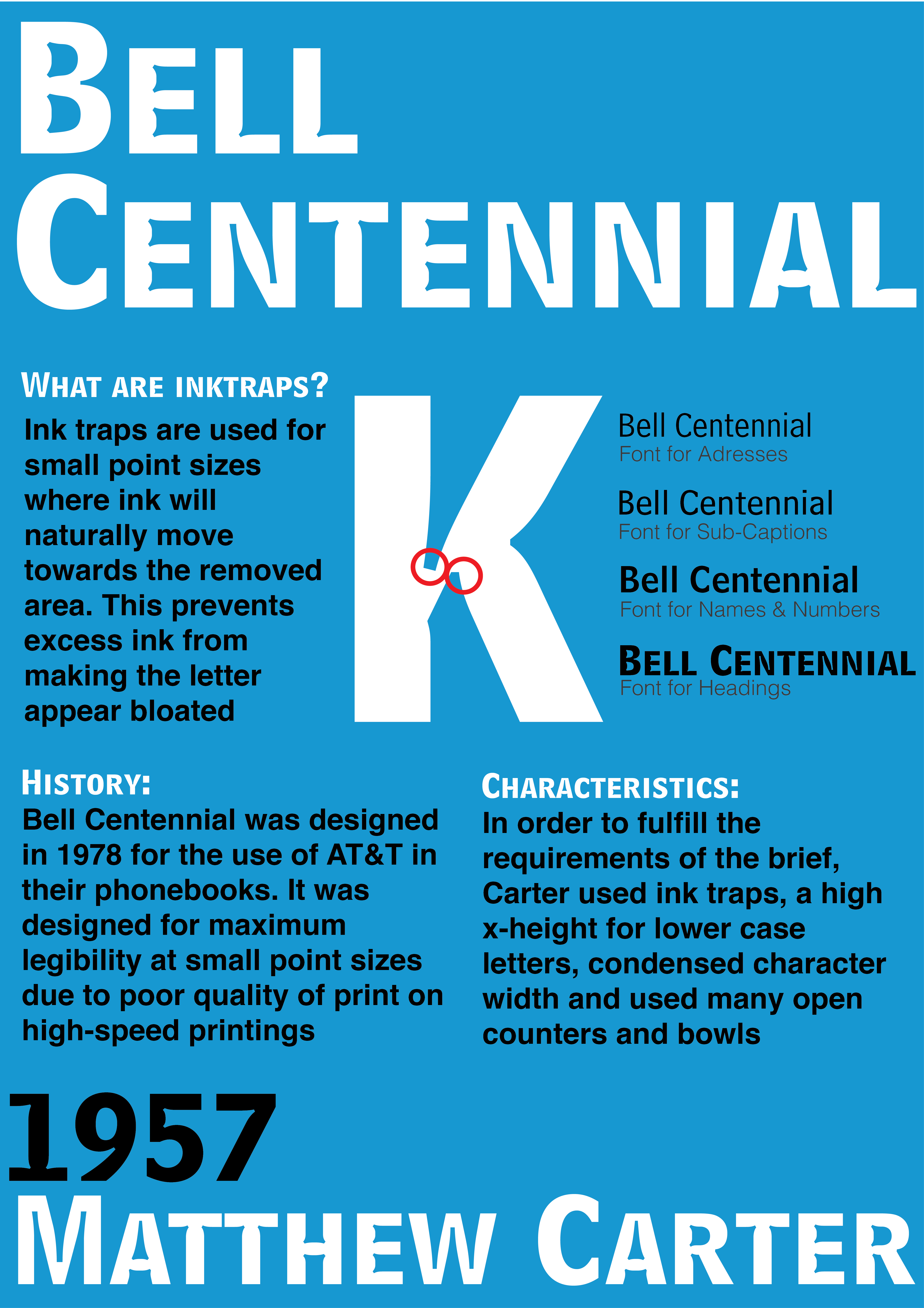
Bell Centennial was designed using the colors of the AT&T
logo in the 1950s. The poster attempts to illustate the great
differences between different font weights used by the typeface.
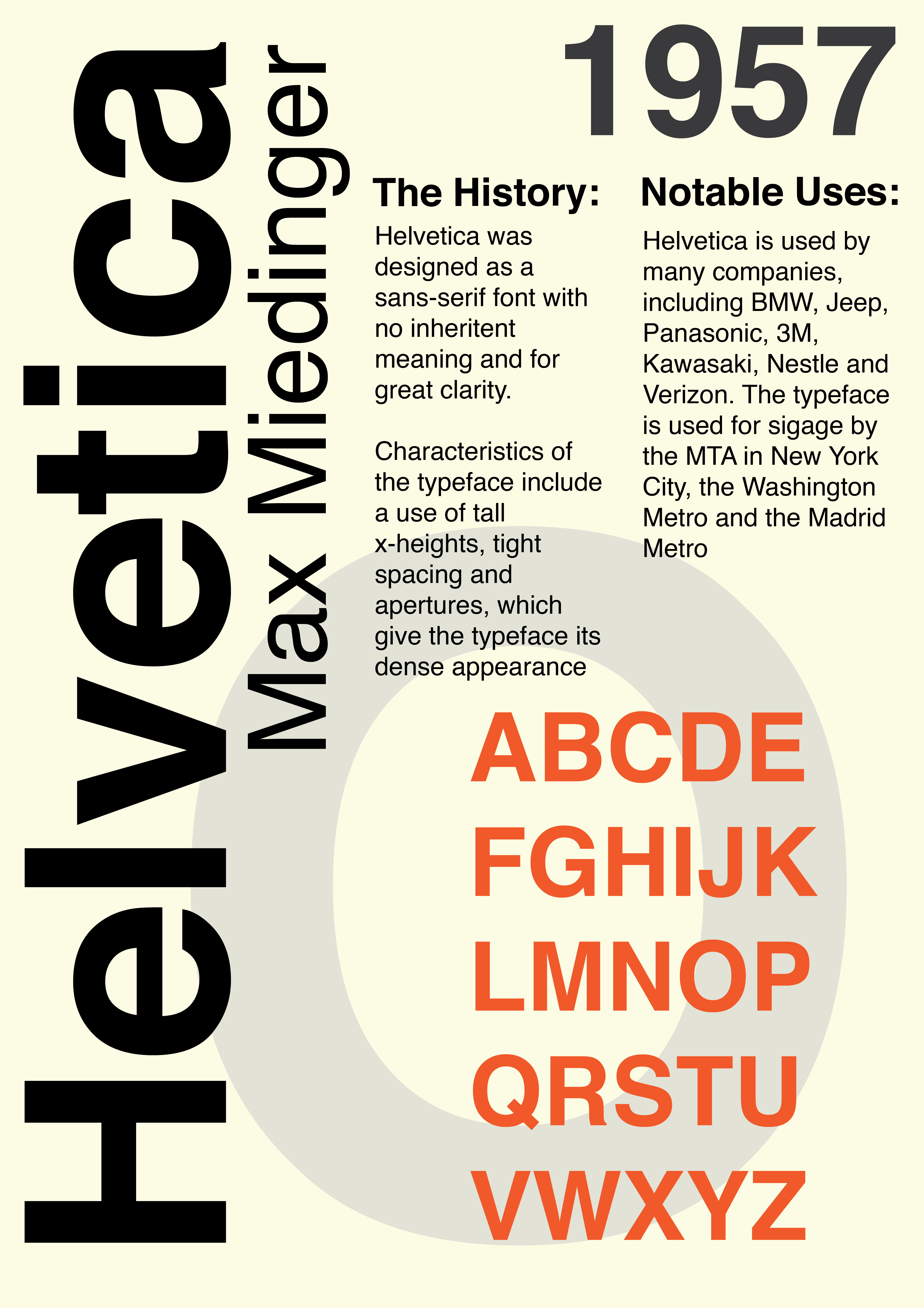
Lastly, the Helvetica poster was heavily inspired by the
modernism that accompanied the rising use of Helvetica and order
sans-serif fonts in the mid-20th century.